PORTFOLIO REWRITE EXERCISE
The thinking was there but the reader had to piece it together.
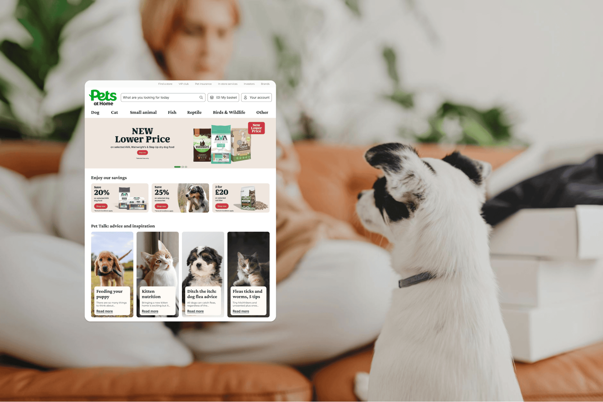
Adam Ridges’ Pets at Home case study has a lot going for it. There’s useful research, thoughtful design work, and a good presentation. But as I read through it, I kept finding pieces of the same idea in different sections.
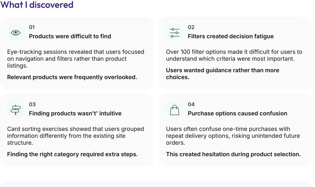
A research finding would appear early on, become a design principle later, and eventually show up in the UI. The connection made sense once I put it together. I just think the case study could do more of that work for the reader.
This is an independent rewrite exercise using Adam’s public case study. Adam wasn’t a client and wasn’t involved.
View Adam’s original case study
Original headline
Simplifying product discovery for pet owners.
Proposed headline
Helping pet owners feel more confident about what to buy.
Here’s what stood out to me
It was hard to tell what deserved the most attention.
The case study includes research methods, findings, design principles, UI, validation, and reflection. There’s value in those details, but giving everything the same space makes it harder to recognize the most important parts.
As a reader, I wanted more direction. Which finding changed how Adam approached the problem? Which decision should I pay attention to? What does this UI help me understand about his thinking?
Those are the questions I would organize the story around.
The reader had to connect ideas across sections.
Some of the strongest material was already there, just spread out.
If a finding explains a design decision, I want to see them together. Otherwise, by the time I reach the solution, I may have forgotten the evidence that made it a reasonable choice.
Bringing those pieces closer would make Adam’s reasoning easier to follow.
The ending could say more about this particular project.
The reflection includes reasonable UX lessons, but I think the project gives Adam something more specific to talk about which is helping people choose when there’s a lot to consider.
That’s what I would come back to at the end. What did this work reveal about the uncertainty people experience while shopping, and how did that affect the design?
How I’d organize it
The current story follows eight stages of the shopping journey, from the homepage through checkout.
That gives the reader a clear tour of the experience. I would reorganize it around the problem, the evidence, the decisions, how they were tested, and what Adam learned.
The UI work would still be there. Each one would sit alongside the reasoning it helps explain, so the reader could understand why it belongs in the story.
The biggest change I’d make
The filters are a good example of why this is needed.
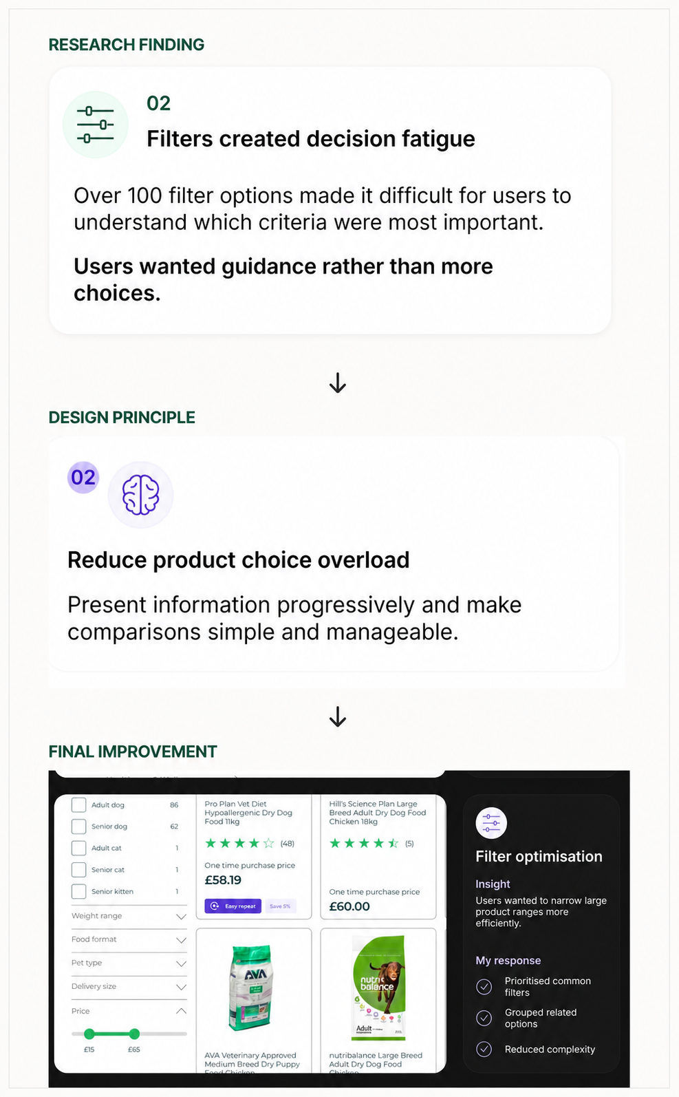
The research identified a problem with too many options. A design principle addressed that problem. The final interface showed a response. I would bring those three pieces together so someone could follow the thinking in one place.
Here’s how I would write that section.
Helping shoppers understand which filters mattered
What the research showed
With more than 100 filter options, shoppers struggled to know which criteria were important. They were spending too much attention working through the filters before they could meaningfully compare products.
The decision
Make the filters more useful for choosing. Bring the important details forward, group related options, and introduce more detail when someone needs it.
What changed
The redesigned product listing brought common filters forward and grouped related choices, reducing how much information shoppers had to work through at once.
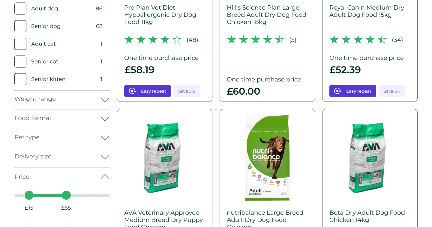
With that explanation beside the screen, the reader has something specific to look for. They can see how the design responds to the research instead of having to make that connection themselves.
Two other places I’d change the writing
Start with what shoppers were struggling with
The original opening introduces the project, the methods, and the intended improvements together. I would give the reader a clearer understanding of the customer’s problem first.
Helping pet owners feel more confident about what to buy.

Pets at Home offered plenty of choice, but shoppers still needed help figuring out which products fit their needs. Navigation, filters, and product information all played a part in whether they felt ready to choose.
Adam used research and testing to rethink that experience from discovery through checkout.
End with what this project taught him
I would also make the ending more specific to the work.
Helping people choose meant addressing uncertainty throughout the journey.
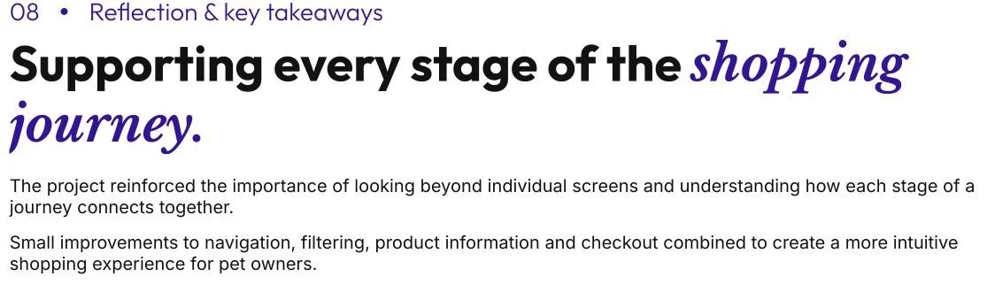
Shoppers needed different kinds of help at different points. Navigation helped them find where to start. Filters helped them narrow their options. Product information helped answer the questions they still had before buying.
Looking at those stages together gives the project a clearer point of uncertainty that goes unresolved early can make later decisions harder.
That’s the idea I would explore further with Adam before writing a final reflection in his voice.
What I’d change and what I’d keep
| What I would change | What I would keep |
|---|---|
| Explanations that repeat the same point | Research that helps explain a decision |
| Sections organized mainly around individual screens | Screens that show how the design responded |
| Related ideas spread across the page | Adam’s reasoning and supporting evidence |
| Reflections that could fit many projects | Lessons specific to this shopping experience |
| Similar attention given to every step | Important iterations and strong visual work |
I would want Adam to recognize his own thinking in the rewrite. The goal is to help someone else understand it more easily.
What I’d need to ask Adam
This exercise only goes as far as the public case study allows. I can suggest a clearer structure, but there are details I would need to discuss with him before taking the story further.
That’s a big part of working directly with someone on a portfolio rewrite. I can ask:
- What were you personally responsible for?
- Which decision was the hardest to make?
- What constraints affected your options?
- What did testing confirm or make you reconsider?
- What kind of work do you want this case study to help you get?
Those answers help me understand what deserves more attention and whether my interpretation matches what actually happened.
For this exercise, I’ve shown how I wouldd connect the material that’s already published. Working directly with the person gives me more context to write something that accurately represents them.
Explore another rewrite
See how I’d make Quentin’s design system impact clearer
See how I helped Amandeep make his research easier to follow
Is your best thinking getting lost in your portfolio?
UX Portfolio Rewrite
If you’re struggling to decide what to include or how to explain it, I can help you figure out what deserves attention and write the story around it.